In this blog entry, I will detail the quilting of this piece and discuss texture, stamping, close and far viewing of the piece, and ranges of color tones and values (light and dark).
I am not satisfied with this piece because it did not bend to my will (haha). I like it, it’s just not what I expected (as usual) and it is finished. I think making things with fabric, paint, silkscreening, dyes, stamping, and other techniques and tools is a bit like a mystery story, but lived and then written down later in a blog. I just went through another Agatha Christie read-it -again, see-it-on-PBS-again, again (that means, I wait a year or two and try to forget some of the plot and especially who done it, then enjoy it again. Repeat. Eventually though, I can offer up quotes before they are spoken or I get to that page). Now I am recycling back through Ruth Rendall and Peter Lovesey stories. I also love Dorothy Sayers, George Simenon, Ann Cleeves More suggestions please, and I hope I haven’t read them yet.
If you recall, we left off last session with none of the color discharge (color removal) attempts working for either the blue or green dyes that I used. Before washing out the dried alginate thickener after the last color discharge attempt, I decided to stamp the edges with a stamp I designed. The stamp (pictured in Photo 1 and 2) is my interpretation of looking into a dense stand of trees and branches. In Photo 3, you can see the results of two stamps: red edging and a red hawk, as well as the beginning of quilting on the piece.

Photo 1. Hand carved stamp designed by Susette to represent trees in a forest and to be used for edges and borders.

Photo 2. The linoleum top is mounted on a pressed board piece to strengthen and make holding and stamping easier. This particular stamp has been used for navy in the past, but unused would be all of one color.
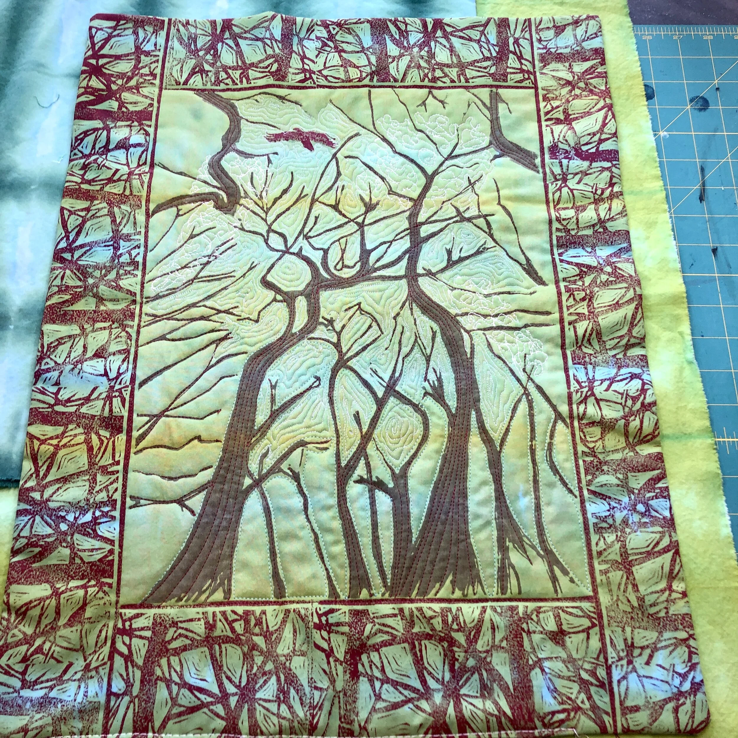
Photo 3. The forest stamp was used to stamp transparent red paint end-to-end around the piece. The whole width was not painted as you can see from residual paint on the stamp in Photo 1. This piece also shows my hawk stamp. At this point the fabric is overlaId onto cotton batting with another piece of fabric at the bottom of the sandwich, ready for quilting. I have just begun to machine quilt the tree trucks in red and between the trees in white and light blue thread.
The quilting part is really fun because you can choose colors, use fancy stitches or not, and use a free-hand quilting attachment. But the key is the quilting foot or “walking foot”. Miracle of miracles. Better than sliced bread. With the old machines and no attachments, the fabric layers slide and bunch, even if you spray adhesive between the layers. The newest $$$ machines have a design where the shaft does the job, don’t ask me how. My Janome machine has a separate walking foot that you can use. The feed dogs pull the fabric through from the bottom, and the foot attachment has two rows of teeth that move up and down and simultaneously pull the fabric through at the top! Makes everything better in a machine quilting piece. Sometimes though, hand quilting is the choice, you can express different emotions through texture, color, and patterns.
ASIDE: Here is a hand quilted piece I did recently using my favorite colors. This piece was shibori folded to dye and then silkscreened using first blue ink, and then discharge color paste. This blue-green dye mixture discharges really well leaving a slight blue cast (depends on the turquoise that doesn’t really discharge much).

Photo 4. Eddy the Cat with Birds Linen Placemat. 2020. The blueish green was achieved using a shibori folding technique; the blue birds and the pale birds were silkscreened with heat-set dye and color discharge, respectively. Hand quilted with machine stitched edging.
Now, I want to show you some photos of the quilting process and my thoughts as I was deciding on color and pattern. In Photo 5, straight stitching red up the trunks followed the major branches out to the tips to add bark texture. Then, I used free form quilting to fill spaces between trees representing the sky. To give the suggestion of white clouds, I used a larger stitch and white thread compared to the light blue for the sky spaces. Combined with a more crooked meandering of stitches and bigger spaces between the lines I created fluffy clouds. The the relatively brighter and looser stitching sets the clouds apart from the sky. What do you think? Did it work? Up close I thought I was doing rather well (Photo 5)
Pinning it to the wall and standing back, not so well; you can't even see the stitches at a distance and they certainly did not succeed in distinguishing the clouds from the sky. Originally, I had planned on discharge to light the sky (the greens and blues) leaving some leafy greens behind. The trunks silkscreened with heat-set acyrlic fabric paints are not affected by discharge techniques.

Photo 5. Quilting trees, clouds, and sky seen between trees.
At this point the only remedies were to use white and light blue to paint something to suggest sky and give contrast when viewing at a distance to complement the hawk and the trees that can be seen easily. So here goes, I painted some on the trunks near the edges to add depth to the picture and dots of white and blue for contrast in the sky. Look at the close, mid, and far views of the final piece in Photos 6-8 below.

Photo 6. Close up view of the final piece with vine, sky, tree stitching and painted highlights.

Photo 7. Mid distance view of the final piece.

Photo 8. The final yet finished piece!
P.S. Here is what the back looks like! TaDa!

Photo 9. The reverse of the finished piece.


